Visa Me - Case Study
Visa application process can be complicated. The application process usually requires many documentations with minimum explanation. Therefore Visa Me will provide a clear checklist on the documentation needed for the application, and it will provide a community for applicants to connect.
Role:
Sole Project, User Interface Design,
User Experience Design, Prototype
Time:
1 Month
Application:
Figma, Adobe Photoshop
Challenge
Visa application has always been one of the biggest topics in Border Immigration Laws. However, the visa application process is surprisingly confusing for applicants to follow. The goal is to ease the application process and provide a stressless experience for the Visa applicants.
Solution:
Visa Me provides checklist for visa applicants to follow. The applicant will be able to select the visa they are applying for, and follow the checklist the app provides. Visa Me also provides a multicultural community for users to ask questions and receive help from each other.

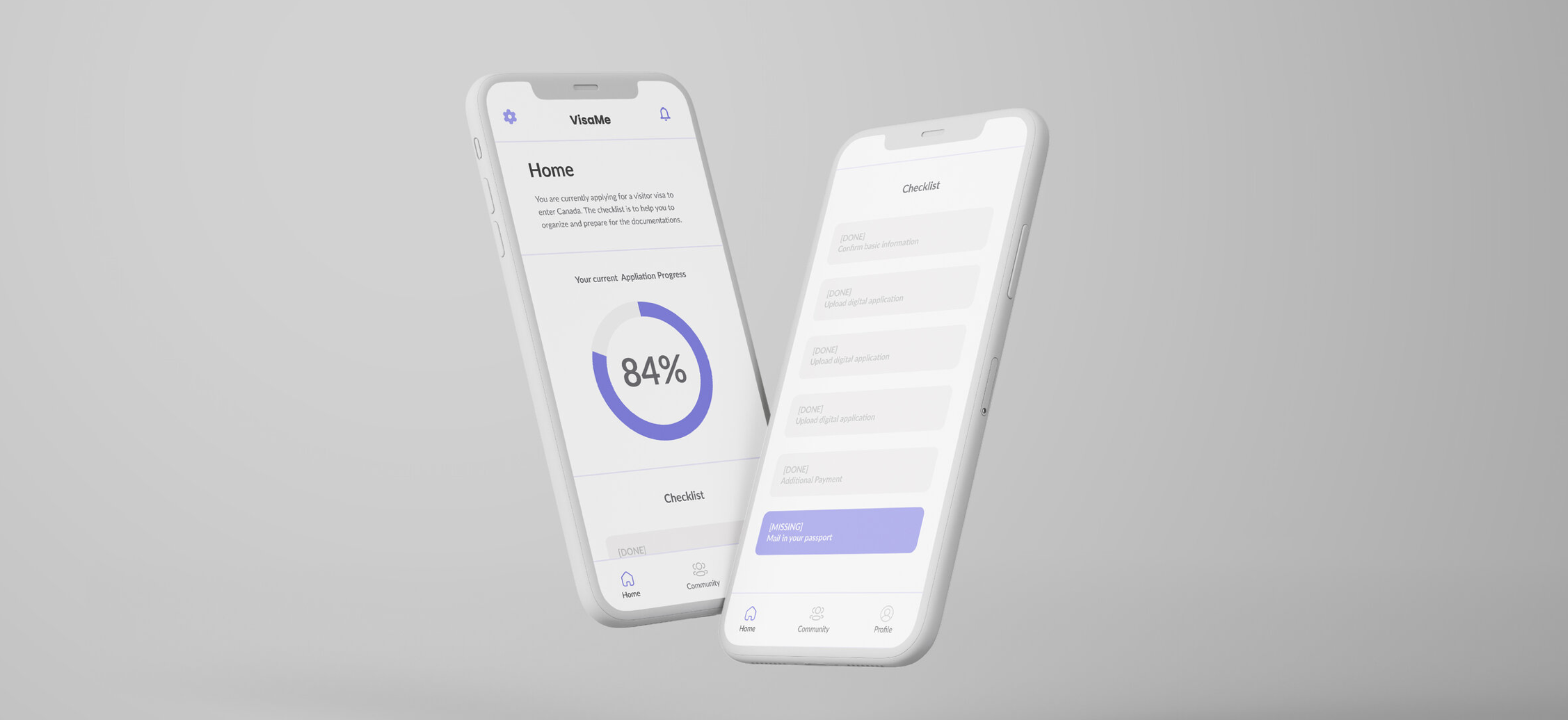
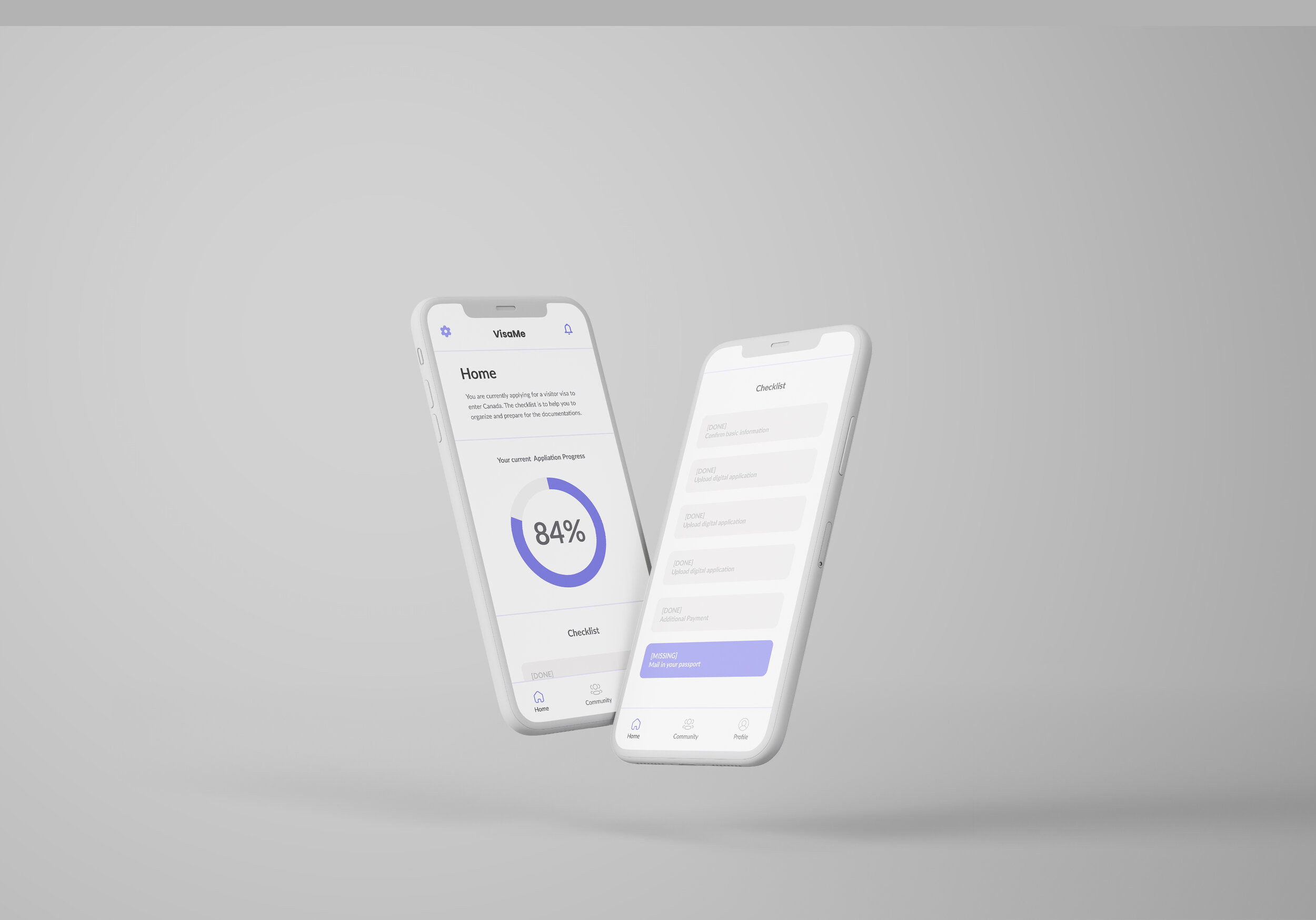
Visa Me - Home Page
Percentage shows the completion of the checklists.

Visa Me - Community Chat
This chat room allows users to communicate with people who speak the same language.

Visa Me - Chat Room
VisaMe provides a platform for users who have experience in visa application to help each other out. Nothing is stronger than a community!
Problem Statement
Due to the lack of transparency surrounding the legal immigration process in the U.S. immigrants may not understand the application process and run into issues.
User Point of View (POV)
Users who have stayed in the country for more than three years need clarity on how long it takes to migrate from one country to another because the process is tedious and hard to understand for the average person.
Users who are coming to the U.S. for college need more information on how to obtain a student visa because they are confused by the information provided on the government website.
Users who applied for visas need more information on the timeframe and the status of the application because their passports are taken away and they would need to ensure that the documents are in the right hand.
Big Question
How might we provide clearer information for immigrants so that they can understand the immigration process and run into less legal issues?
User Research
Interview
I started with interviewing three people to understand their in own experience with the visa application process. During the interview, the users have shared their experience in where they found it stressful and where they found it helpful. The following information are the interview findings from each person.
Please note that do not have the permission to reveal their real names, so in this case study, they will be called in the nicknames.
Person A
Summary
The first person I interviewed with is a foreigner of the United State. He is currently holding a student visa to stay in the country.
Findings
During the interview, he shared his experience of applying for a visitor visa to enter Canada. As a foreigner with student visa, he had to look up the government website and figuring out the whole process on his own.
Pain Points
“The description of each document and each process are not well explained.”
“I always need to find additional information online, such as search for other people’s experience with applying for the same visa”
“The process is just too complicated”

Person B
Summary
The second person I interviewed with is a European, who decided to study abroad in the United State. Due to her nationality, she is required to obtain a student visa in order to study in the United State, in the interview, she talked about her process of applying
for the visa.
Findings
She is from Romania; however, her application is done in Vietnam. Her experience with in person application service was really good. She mentioned that they were really helpful. During her visa interview, she forgot many things such as photos, and she mentioned the office had guided her through it.
Pain Points
“There are so many things to bring, and it is really easy to forget things, such as photos.”

Person C
Summary
The third person I interviewed with is from China. He is currently holding a Canadian Working Visa, but also has experience with US Visitor Visa Application.
Findings
Five years ago, he applied the US Visitor Visa all by himself. He mentioned he was still a college student in Canada when he applied the visitor visa, but he really wanted to visit the United State, so he wanted to do the application all by himself. However, he found out the application process a bit confusing to understand, so he paid the agency to do it for him. Overall, the most difficult part for him is that he had to take 2 hours bus to the closet office near him, so that he could finish the interview process.
Pain Points
“The in person interview is stressful, and I had to take 2 hours bus to the closest office near me.”

Target one problem to solve
After gathering all the information, the experience, and the pain point from the interview, I decided to narrow down the problem with visa application and focus on Person A’s pain point

The application requirements are not well explained
Always need to search for people who have experience with applying for the same visa
The process is too complicated
“When applying for a travel visa, I want a clear guidance, so I can finish my application without any issues.” - Person A
Ideation
Storyboard
I created a storyboard to showcase how VisaMe is going to be used by the user. The important interaction is when the users interact with the app, the confusion and the frustration they have build up by figuring out the difficult visa application process disappears.

Wireframe

Design Languege

Prototyping
Low-fidelity Prototype
I started with creating the low fidelity wireframe to present the idea, and to come up with an immediate solution to evaluate. The first idea is to create an app for visa application. However, after presenting and discussing the idea to a potential user - Professor Jean Menezes from University of California - Davis, and he pointed out some of the concerns, I realized that making an visa application app that works with government is unrealistic and challenging...

High-fidelity Prototype
After brainstorming and re-evaluating the idea from the wireframe, I decided to make prototype into a visa application checklist for foreigners who are applying for the visa. Due to the variety of the existing visa, I decided to focus on making a checklist for Canada visitor visa, which is the visa that Person A applied for. The prototype contained several features, such as the checklist page, the passport tracking page, and the community page.


User testing and feedback
I started to test the prototype with three different users, and I gather feedback from the testing experience. Here are the summary and the findings from each tester.
Tester 1
Findings
The first thing I have noticed during the user testing was that Tester 1 did not understand the meaning of the icons. However, the tester found the task easy to navigate and easy to finish. Once the task was finished, Tester 1 said that she wanted more indications that she already finished that particular task, and she expected to have more description in the app. The tester claimed that the tracking visa page is clear, but the third page, which was the forum page was a bit confusing.
Feedback:
“The meaning of the icons aren’t clear”
“I want more description from the app”
“Forum page is confusing”

Tester 2
Findings
Tester 2 said similar things that what Tester 1 has said, but one thing she pointed out is that the tracking page does not make sense because there are other apps she would use to track her package, using this application to track is just confusing, and she would not use this feature at all. She also mentioned that the featured bar and the forum bar are similar, this makes me think about combine and redesign them more.
Feedback:
“The tracking page does not make sense because there are other apps she would use to track her package”
“Community page is confusing”

Tester 3
Findings
The third tester said that he liked the application progress graph with percentage showing because it helped him understand how far to reach the finish line. However, for the “Mail in your passport,” he mentioned that the address is hidden in the paragraph and he suggested to put the address in an individual paragraph/line.
Feedback:
“Address line isn’t clear”
“Percentage is helpful”

Iteration
User testing is extremely useful. I took the feedback I got from the testers, and I iterate my prototype based on the feedback I received.
“The meaning of the icons aren’t clear”
To solve this problem, I added the title below each icon so that the users will have a clear idea on what each icon means, and they no longer have to guess the mean of each icon.
“I want more description from the app”
To address this concern, I added a description in the home page, the information from this section will communicate with the users, and it will explain what type of visa the user is applying for, and it will introduce the checklist feature to the user.
“Forum page is confusing”
Forum page has a big change, I reorganized the page and separate the page into two parts, one for the community post, one for chat room. The goal is to help people who speak different languages from different language to connect and help each other out.
“The tracking page does not make sense because there are other apps she would use to track her package”
I agree on this statement, and I believe tracking package is not the main purchase of the app; therefore, I remove the feature from the navigation bar, and put it inside the checklist ( I will demonstrate it in the walkthrough). The feature is also optional to use.
“Address line isn’t clear”
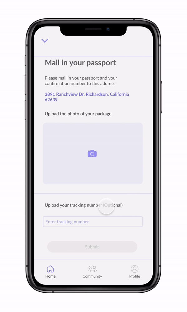
I fixed this problem by having the address in different line and different color.


VisaMe Walkthrough
After explaining what I did to improve my prototype, here is the more in depth walkthrough of the important interaction of the prototype.

Checklist
The first interaction is to click on the checklist. The percentage on the home page lets users know how they are doing and they can track their progress. I have received possible feedback on showing the percentage of the application progress.
When the user scrolls down, all the finished tasks will show in the grey color, and the task that still needs to be done will showcase in the purple color. Once the user clicks on the task, a different page will show up with a description of the task.

Task
After clicking the task from the checklist, a new page will show up. The user will follow the requirement, and click submit to finish it.
After the submission button is clicked, the user will be led back to the home back, where they can see the updated percentage of their progress, and the task bar that was highlighted in purple, will become grey to indicate that the task is finished.
Tracking
I mentioned that I removed the tracking feature from main navigation bar inside to the task. Here, the optional tracking information will be available for users to track their package. The frustration of not knowing where the passport is truly stressful; therefore, the users will have a chance to submit the Tracking Number when they were finishing the task that requires passport or physical document being sent in. The button where the users can see their tracking information will show up next to the original task.

Community
By clicking the community icon on the navigation bar, the users will see a brand new section of the app. The community section includes “Community Post,” where the users can browse, post, and reply topic related to visa application, and the “Community Chat” section allows users who are from the same country, speak the same langurs to connect together and help each other out.

Community Chat Room
Here is how the chat room will look like. Users will be able to find the group that fit the best of their need. For example, if a Taiwanese user wants to ask question and find people who have applied for the same visa in mandarin, the user will be able to find a group that speaks the same language.

Overall
Overall, the visa application process can be extremely complicated. The application process usually requires many documentations with minimum explanation. Visa Me is here to provide a clear checklist on the documentation needed for the application, at the same time, it provides a safe community for applicants to connect.

UI Demo
This is a video of me actually interact with VisaMe app that I designed!